Branding A Company for Strategic Growth
 Designer and brand expert (and Google Analytics addict) Susan Newman started doing interviews about branding and positioning on her Branding You Better website. There’s a new one every few weeks or so, and they are incredibly insightful. Anyone interested in learning how to brand your business for strategic growth should read through a few of her brand interviews, and see how others who have been successful have done it.
Susan asked Circle Marketing’s Louis Tanguay to be a part of that series, and he naturally accepted as it’s a great honor to be associated with the large number of companies and brand experts Susan interviews. You can read the entire article here on Susan’s Branding You Better website. We pulled out some snippets below to whet your appetite…
How did you know what typeface (font) would be right for your company wordmark or logo, and describe why your logo was the right object for your company.
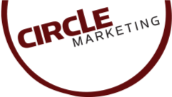
We chose the Circle Marketing typefaces based on a combination of things. First, we wanted a sans serif font, because we felt that visual style conveyed a more modern and more legible feel. We enhanced the typeface and used two different fonts we had in stock to create a custom face. We chose to have a large, bold and red “CIRCLE” because that’s the basic concept of the company, appearing in many of our promotional materials, like the “Circle of Marketing” and such.
The “Marketing” font is thinner, but still all caps. So, while it is smaller and thinner, it’s not “wimpier.” Also, the “Marketing” word changes in our animated logo which helps the first-time viewer understand a little bit more of what we do.
The circle itself, is more like an eclipse than a perfect circle with a perfect border. This is to add some weight and balance to the entire logo. The sides of the circle are thinnest near the type, and heaviest where there is an absence of type. This varying thickness also helps create a more interesting visual and negative balance, than just a standard circle with a thick border would.
How did you decide on the right color palette to fit your company look and feel?
We wanted to be known for professional and clean marketing. That’s been a personal trait of mine ever since I was a graphic designer in the 90′s. I always felt that a clean look will always trump a busy look. It’s also better for small businesses to look more “professional” when they have a clean and balanced look, as opposed to collages and who-knows-what that the average bargain-basement designer will offer their competitors.
We chose red, because we wanted a POP color. My personal favorite color is green, and I love orange as well, but this company isn’t about me. It’s about our clients, customers and partners. We thought orange would be a great color, because it’s fresh, new, and is an “action” color, but so many companies out there are using orange because of that very reason, that we wanted to stand out from the crowd (like we tell our customers to do). We went with a deep red, because it still has the visual pop we’re looking for, is close to a “lighter burgundy” but not as stuffy and boring, and is striking but not alarming or forewarning like a brighter red would be. When you have a clean and white brand, that could look plain with a plain accent color. Therefore, the red helps add some punch and pop which also helps balance the brand’s essence and communicates our messaging through our visuals.
Other questions and answers included the transition to Social Media Marketing, Online Advertising for your business, and future directions for the brand and business. Check it out here, and leave comments below!
Read More: Check Out Our 5 Most Recent Posts:
- Combine Targeted Advertising with Segmentation for the Most Effective Strategy to Increase Conversions
- How Small Businesses Can Compete Against Big Box Stores and Amazon.com
- Focus On Increasing Profits, Not Price
- Marketing Collateral – No Such Thing As A “Throw Away” Item
- Grow Your Business 30%…or More!


sign-up for our email list below,
and we’ll send new articles directly to your inbox! NOTE: We don’t spam and we’ll NEVER give away your email address
to ANYONE. You won’t like us if we did that, and we’re here to help you!


