The FedEx Logo – Branding At It’s Best
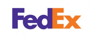
 You have seen the FedEx logo before many times. You may have even noticed the tiny arrow hidden in there. You have seen the colors. Maybe you like it, maybe you think it’s boring, maybe you think it’s brilliant. I’m in the latter camp. I think, personally, that the FedEx logo is one of the best pieces of branding ever created. It’s my duty to explain why this is so amazing; but first, just a little history (but enough to put you to sleep)…
In 1994, a senior design director by the name of Lindon Leader, working at the Landor Associates in San Francisco came up with this stroke of brilliance. Leader had an amazing apprenticeship right out of college, by working for Saul Bass, who designed the AT&T logo among many other iconic images. Leader worked for Bass right after graduating from one of the best design school in the country, Art Center College of Design in Pasadena, CA (which is literally just mere minutes outside of Los Angeles).
Like most great designs, the first versions were not the best. Leader stripped away some of the busy elements and broke it down to simple, yet elegant. It’s similar to the great chef Gordon Ramsay’s cooking. Simple great technique with the right combination of ingredients equal gourmet cuisine. If the FedEx logo were a restaurant, it would have three Michelin Stars.
The purplish blue in the “Fed” portion of the log represents business, reliable, regal stability. The orange in the “Ex” portion of the logo represents action, mobility, movement. For obvious reasons, they are the absolute perfect combinations to match their meanings and provide a subliminal definition behind the words.
Now for the icing on the cake, look at the negative space (aka white space) between the lower half of the E and the left side of the x. You will see a white arrow perfectly placed on the orange Express side of the logo, finally driving home that last punctuation at the end of the perfectly-crafted sentence. It’s like the final paragraph of a novel which finishes the story perfectly and wraps everything together in one nice, tight package.
The FedEx logo is the perfect combination of colors, readability, subliminal brand positioning, and one complete concept which fits the business and what they do, and how they do it, perfectly to a T. Just try to get THAT on Fiverr! Ha!
If you are interested in creating branding which helps you stand out from the crowd of competitors, then Contact Us to discuss the various Branding and Marketing Services we can provide and help you achieve the brand messaging you need to take your small business to the next level.
Read More: Check Out Our 5 Most Recent Posts:
- Combine Targeted Advertising with Segmentation for the Most Effective Strategy to Increase Conversions
- How Small Businesses Can Compete Against Big Box Stores and Amazon.com
- Focus On Increasing Profits, Not Price
- Marketing Collateral – No Such Thing As A “Throw Away” Item
- Grow Your Business 30%…or More!


sign-up for our email list below,
and we’ll send new articles directly to your inbox! NOTE: We don’t spam and we’ll NEVER give away your email address
to ANYONE. You won’t like us if we did that, and we’re here to help you!


