ESPN.com Re-Design FAIL
We’ve seen it before. Re-Design Fails by large companies which result in such a backlash that they have no choice but to return to the “old” design. Remember The Gap logo? The $800,000 2012 London Olympics logo? The 2009 re-branding fail of AOL? Well, OK, maybe no one remembers the AOL re-branding because…it was AOL in 2009. ESPN.com is the next “winner” in the unfortunately long list of corporate re-designs. Since this launched at midnight on April 1st, we were all hoping it was just one big April Fool’s joke. However, the joke was on whomever approved such a disastrous re-design with horrible usability and insanely blatant advertising money grab.
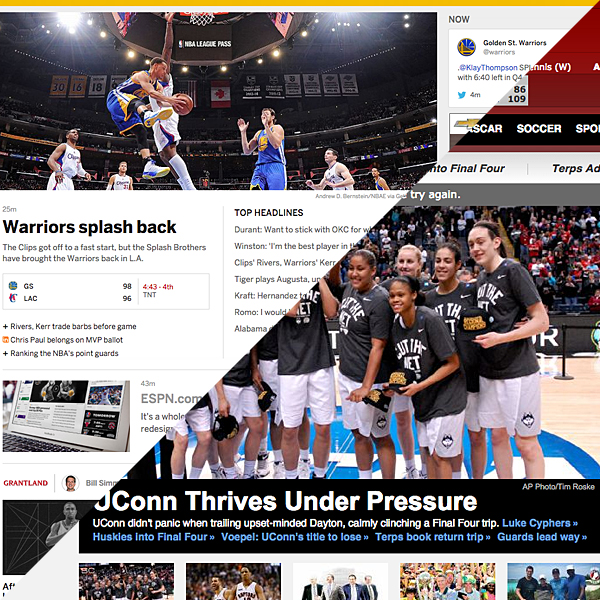
THE OLD WEBSITE DESIGN
 ESPN.com in the good ole days of late-March 2015 was a pleasant experience. Everything was pretty much “above the fold,” and we could customize information to a sufficient degree. We had some featured image top stories as soon as we looked at the page, and also a bulleted list next to it for other developing news.
There were ads, but nothing too intrusive. Information was organized together in comprehensible blocks. Top stories at the top, sister-site Grantland articles to drive traffic there, and Videos in a nice block together. The worst part of the design was buried at the bottom, in a mishmash of additional “stuff.” Random blocks of links and polls which didn’t seem to be together in any intelligent, discernible arrangement. However, this was all at the bottom of the page, and if you’re going to make a content mistake, make it there…I guess.
Instead of improving what was broken there at the bottom of the website, ESPN.com decided to just overhaul the whole thing. They “fixed” what wasn’t broken, and didn’t really address the issues with usability which were in the “old” design.
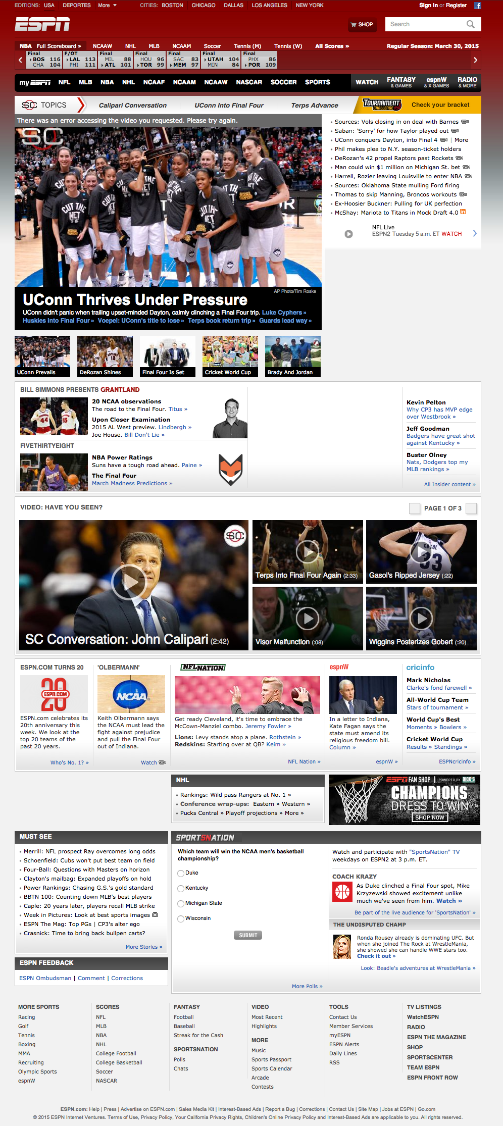
THE NEW WEBSITE DESIGN
 ESPN.com now thinks it knows what you want, and it’s going to give you only that. Right away, you notice the massive Re-Skinning Advertising which takes up 25% of the above-the-fold real estate on the desktop view, and an interstitial ad pops-up when viewing on a tablet. On the tablet, after you dispose of the interstitial, you then have to deal with a drop-down ad, taking up the majority of your viewing area. Fun. Ads. Yay.
This isn’t the largest redesign fail, however. It’s the lack of immediate visuals. You only see a single featured image for a single featured story. If there is more than one major event going on at the same time, then you no longer get to see a carousel of photos. You see one. You get that one. You must have that one.
The new design is divided into three columns. The left-hand column of “Favorites,” the main middle column which features an endless scroll, and the right-hand column of trending writer Tweets and current trending topics.
The left column, for your “favorites,” allows you to see your selected teams scores and news. The right column is heavy on the writers and personalities of ESPN.com. You will see Tweets upon Tweets, and you cannot customize that section. You just deal with whatever ESPN.com has curated for you.
The main middle column is where the second most egregious design fail is (we’ll get to the most in a minute). Besides the lack of options, you now have to keep scrolling through story after story to find what might jump out at you. After a few flicks or scrolls, everything starts looking the same. There are no sections, nothing to customize, and everything just seems to keep coming at you in a seemingly random mix of who knows what? It makes sense that ESPN.com would have this random, confusing approach, looking at how much they seem to love Twitter. After all, Twitter doesn’t curate their Feeds. They just give you what’s last been published. Unlike Facebook, which tries to fill your News Feed with things you have shown interest in in the past, the new ESPN.com throws everything at you, and dares you to find the end of the page as you scroll scroll scroll through a bunch of stories you mostly don’t care about and will never read.
WHAT’S GOOD ABOUT THE NEW DESIGN
OK, so I railed against it enough, but there are some good things. The main improvement is the recent scores in the header. In the previous design, you just saw a bunch of abbreviated team names and scores. Now, however, ESPN.com put in team logos, and allows you to scroll through all the current scores instead of having to select a sport. You can still select a particular sport if you wish, but it’s definitely a UI/UX improvement over the previous design.
The ESPN.com home page in this new design is all about Fail. The Favorites left-hand column is a nice improvement. We can see information about the teams we care about most. It would be better, however, to include some player information there, since ESPN.com allows you to select your favorite players as well as teams. Alas, this is not the case. It’s an improvement, but doesn’t go far enough. With the infinite scroll of the other two columns, I don’t know why ESPN.com wouldn’t allow you to see all the Favorites you have marked, but maybe they’ll add that ability…but don’t count on it.
The New Design is responsive, so I guess that is a good thing. However, with all this scrolling, it’s going to get old pretty quick on your mobile device. The one good feature of the responsive design is that the first column to drop from view is the “Now” trending right-hand column which is pretty much superfluous. When viewed vertically on a tablet, this new re-design is a very clean read once you do find an article you like. There is nice breathing room on either side of the article, and (when viewed vertically on a tablet, remember) the look is clean…for that single article.
WHAT’S WORSE…THAT WE HAVEN’T ALREADY MENTIONED
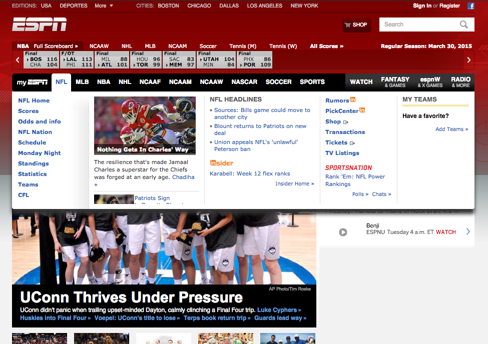 A feature that’s been downgraded has been the overlay/drop-down for the main sports sections. In the previous design, ESPN.com gave you a featured story with a photo, as well as headlines, so you can see what’s trending in that sport. You could also easily get to the main category-specific links such as “standings,” “statistics,” “schedule,” etc.
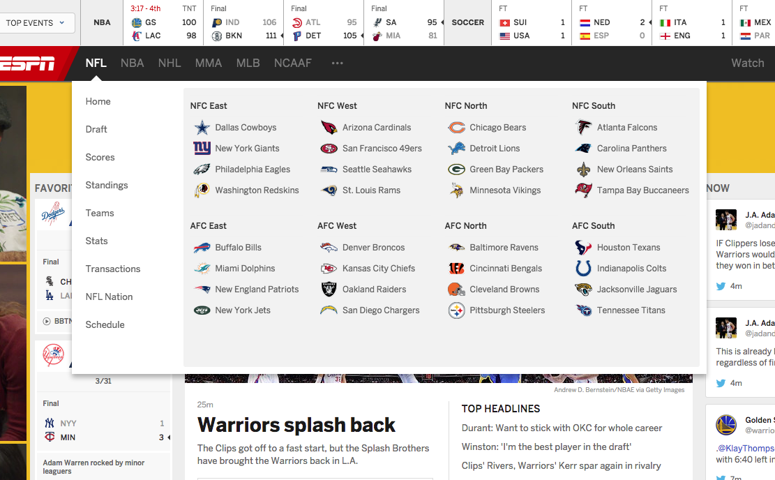 However, in this new ESPN.com Re-Design Fail, you see no news. No trending topics for that sport. No photos of a featured article. Only the ability to see the category-specific links, and the ability to click on any team in that league. This re-design is for you to either get a bunch of random information (as displayed in the main middle column of the home page), or very specific information (as displayed by giving you scores on your favorite teams, or the ability to drill down to a specific team). If you’re a fan of, say, NFL Football, you cannot see that information easily without having to click to that category’s home page.
THE ABSOLUTE WORST ESPN.COM DESIGN FAIL FEATURE
 The worst ESPN.com fail is in the interior pages after you click an article. Here, you will be bombarded by ads, sponsored links, and ESPN.com’s pay-to-view “Insider” teases and up-sells. The Outbrain sponsored headlines are really annoying, because that content is largely not about sports, and is stripped in after every two articles or so. Many of the Outbrain headlines are click-bait adjacent (if not straight-up click-bait), and really bring down the experience of reading these articles.
Speaking of the articles, this is where ESPN.com feels you’ll be spending most of your time, because they are throwing articles at you left, right, and center (literally), and they want you to get into the articles themselves instead of just browser around.
That said, users these days prefer watching videos instead of reading. So, focusing on the reader makes sense for their sister-website Grantland, which features magazine style and length articles which are well-written. While I do not have the full analytics report on ESPN.com’s user behaviors, I will use admitted conjecture and state that the majority of ESPN.com visitors will prefer watching video over reading articles. After all, ESPN was first, and still is, the most popular and go-to television sports channel. Favoring video over the written word seems like a logical through-line to me. The “readers” will head over to Grantland which has much better writers and deeper articles. ESPN.com has more generic news information which doesn’t have to be read as thoughtfully. Just give us the sports news, ESPN. That’s what made you who you are.
NOTE: Due to the screenshots being placed together, the screen shot here looks like there are repeated ads in the left-column, but there left-column (in the article view) follows the user down the page and does not feature all the ads shown in the pieced-together screenshot here. All other screenshots are 100% accurate.
HOW TO BEST VIEW THE NEW ESPN.COM RE-DESIGN
So, knowing all this, and analyzing the new ESPN.com, I suggest viewing this website in a thinner browser window, or vertically on a tablet, so that useless and boring right-hand content goes away, and you have less visual distractions on the page as you view it.
Doing this will also cause the left-hand column in the interior article pages to drop off from view as well, and allow a much cleaner read of the article itself. This new ESPN.com re-design was clearly created with the tablet viewer in mind. The experience on a vertically-held tablet is a vast improvement over the previous design…but at what cost? The rest of the website is a complete fail. What good is making the article reads better if the process of getting to those articles is confusing and frustrating?
So, to wrap it up, while there are some definite improvements in the new ESPN.com re-design, it is largely a “fail,” because it seems like ESPN.com’s UI/UX team had only a single use case in mind (the tablet viewer who likes to read many articles), instead of a more general user base which might have a wider range of viewing preferences.


Read More: Check Out Our 5 Most Recent Posts:
- Combine Targeted Advertising with Segmentation for the Most Effective Strategy to Increase Conversions
- How Small Businesses Can Compete Against Big Box Stores and Amazon.com
- Focus On Increasing Profits, Not Price
- Marketing Collateral – No Such Thing As A “Throw Away” Item
- Grow Your Business 30%…or More!

sign-up for our email list below,
and we’ll send new articles directly to your inbox! NOTE: We don’t spam and we’ll NEVER give away your email address
to ANYONE. You won’t like us if we did that, and we’re here to help you!